
Brand consistency across print comes down to writing down four things once — your exact colours, your fonts, the rules for using your logo, and your preferred paper stock — and then applying them the same way on every item, from business cards to packaging swing tags. Most inconsistency does not come from bad design decisions; it comes from nobody writing these choices down, so each new item gets designed slightly differently by whoever is working on it that week.
Why this matters more than most businesses expect
Customers build trust in a business partly through repetition and familiarity — seeing the same colours, the same tone, the same logo treatment across a business card, a flyer, packaging and a website creates a sense of a business that has its act together, even before someone has read a word of the content. A mismatched set — slightly different blues, three different fonts, a stretched logo on one item and a squashed one on another — creates a subtle sense of disorganisation, even if the individual pieces are each well designed.
The four things worth defining once
1. Exact colours
"Blue" is not a brand colour; a specific colour code is. Define your palette using CMYK values for print and, separately, hex codes for screen use, since colour translates slightly differently between the two. Without exact values, every new supplier or designer picks their own interpretation of "our blue", and colours drift over time.
2. Fonts
Pick one or two typefaces — commonly one for headings and one for body text — and use them everywhere. If your primary font is not freely available (some paid or custom fonts require a licence), agree a close, freely available substitute for situations where the licensed font is not accessible, so items designed by different people still look aligned.
3. Logo usage rules
A handful of simple rules prevent most logo misuse: a minimum size below which it should not be printed (small logos lose detail and legibility), a minimum clear space around it (so it never touches another element or the edge of a page), and which colour versions are approved for use on light and dark backgrounds.
4. Paper and finish
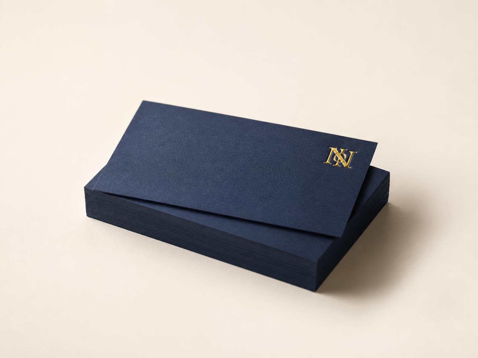
Paper choice is part of a brand's feel just as much as colour and font, even though it is easy to overlook. A business that always uses an uncoated, textured stock projects a different feel to one that always uses a high-gloss finish, and switching between the two across different items undermines the consistency built up everywhere else.
| Item | Where consistency shows up |
|---|---|
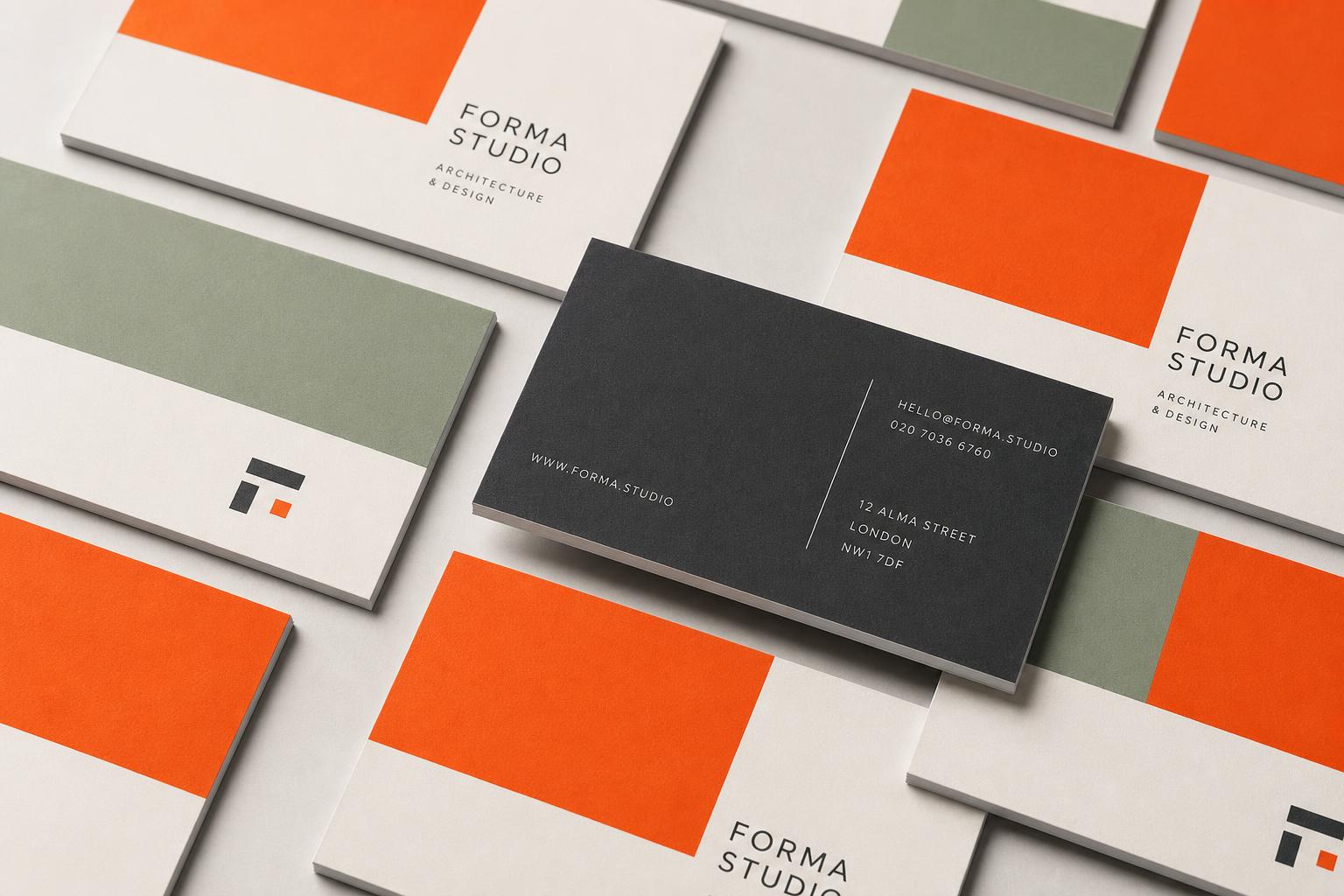
| Business cards | Logo placement, colour accuracy, paper weight and finish |
| Flyers and leaflets | Heading font, colour palette, tone of the copy |
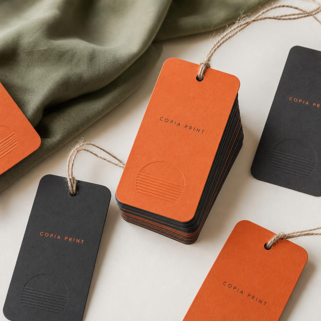
| Packaging and swing tags | Logo clear space, colour on different substrate types |
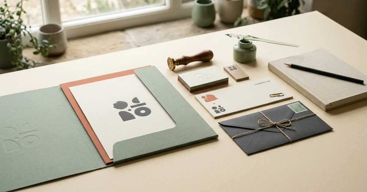
| Notebooks and stationery | Cover branding, paper stock choice |
Putting it together: a one-page brand reference
None of this requires a lengthy brand guidelines document. A single page covering your colour codes, your fonts, three or four logo rules, and your preferred paper stock is enough for most small businesses, and it means anyone briefing a new print order — including a freelancer or a new team member — has something concrete to check against rather than relying on memory or guesswork.
Keeping it consistent as you grow
- Share the one-page reference with anyone ordering print on the business's behalf, including freelancers and agencies.
- Reprint or update older items gradually rather than all at once if you refresh any part of your branding — but update the reference document immediately so future orders use the new version.
- Keep a small physical swatch or sample of your paper stock alongside your colour reference, since paper affects how a colour actually looks once printed.
- Review your printed materials together occasionally — laid out side by side, inconsistencies that are invisible item by item often become obvious.
The short version
- Write down exact colours (CMYK and hex), fonts, logo rules and paper stock once.
- Share that one-page reference with anyone ordering print on your behalf.
- Paper and finish are part of brand consistency, not just colour and logo.
- Review printed items side by side occasionally to catch drift early.