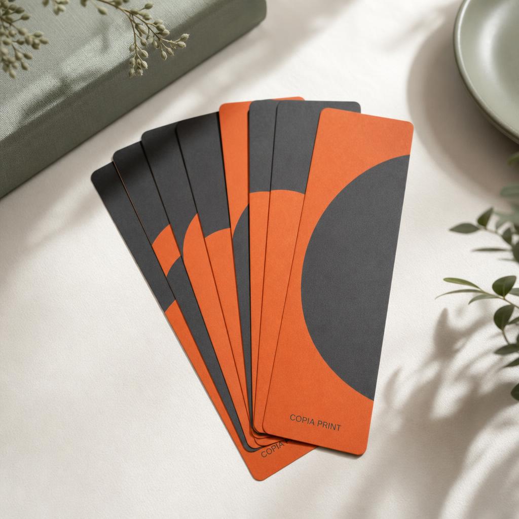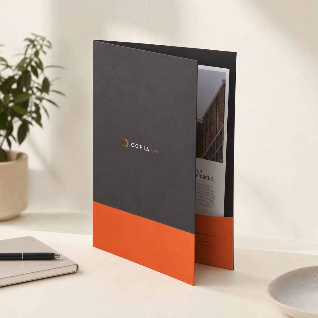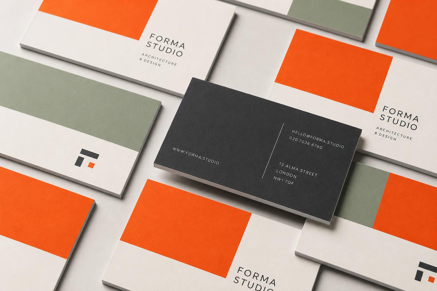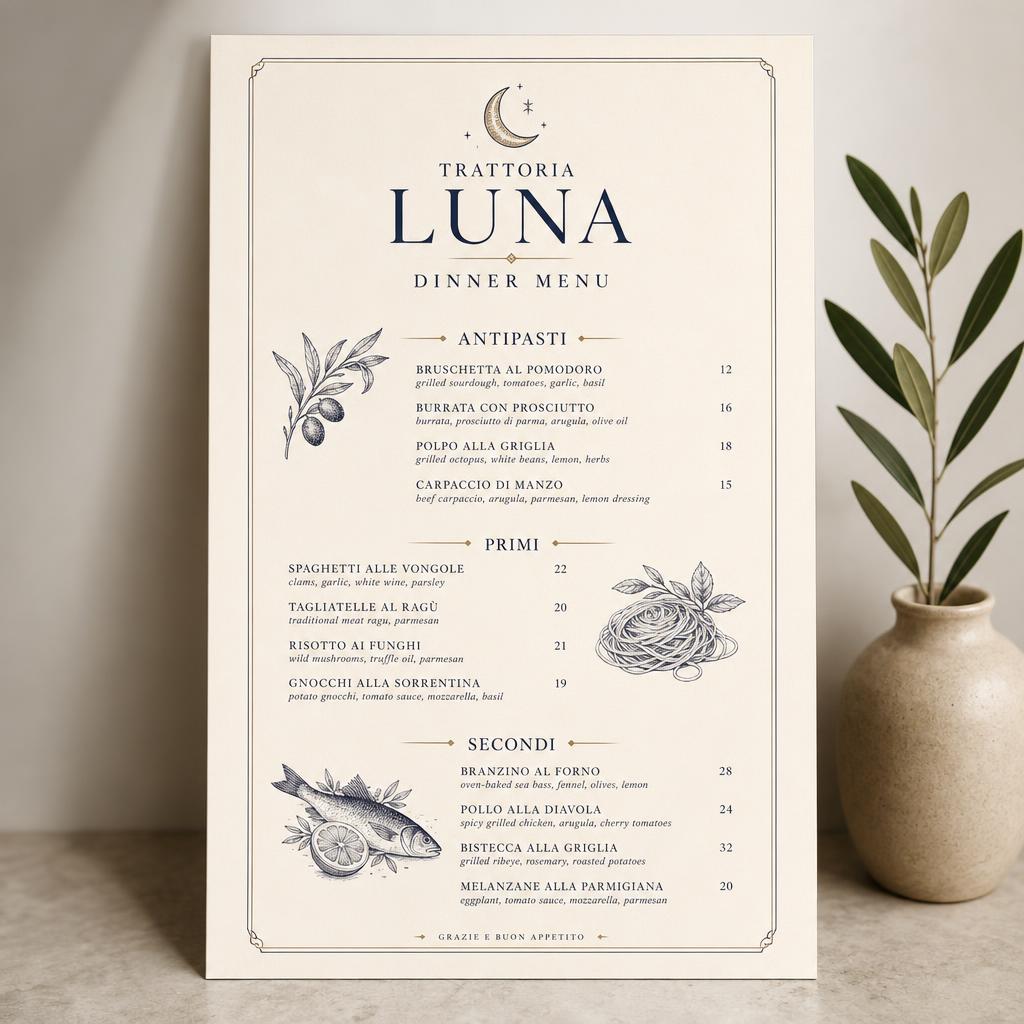

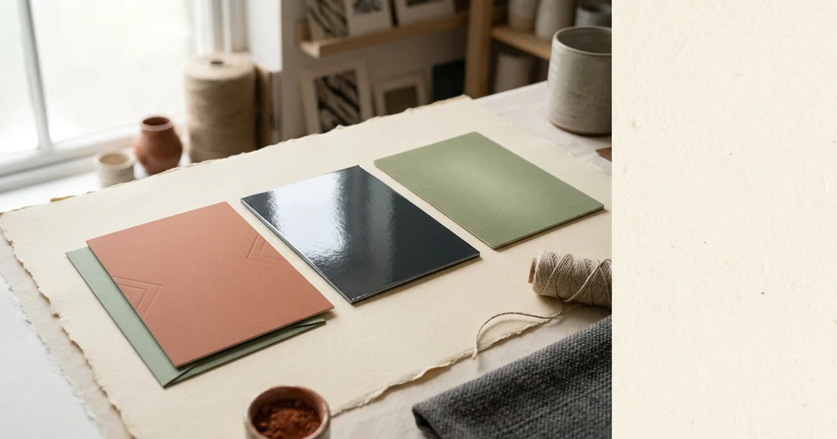
Lamination is a thin film bonded over the printed sheet under heat. It is not varnish, and the difference is real: film protects edges, resists moisture and roughly doubles the working life of a handled item.
Matt
Non-reflective, smooth, faintly velvety. Matt is the most-requested finish for business cards and premium covers because it looks restrained and photographs well under any lighting. It slightly reduces colour saturation, so very bright brand colours land a shade calmer.
Gloss
Reflective and hard-wearing. Gloss deepens dark tones and makes photographs pop, which is why it dominates menus, flyers and packaging. The downside is glare under overhead lighting and visible fingerprints on dark solid areas.
Soft-touch
A matt film with a suede-like surface. It is the only finish people comment on unprompted. Soft-touch mutes colour slightly more than standard matt and costs more, so it is best reserved for items where the first physical impression is the point: business cards, folders, invitations, brochure covers.
One caution — soft-touch marks more easily than gloss. Fingernails and keys leave visible scuffs on dark soft-touch cards.
Anti-scuff
An anti-scuff matt laminate resists the marking that plain matt suffers on dark backgrounds. If you are printing a near-black cover or card, it is worth the small upcharge.
Spot UV over lamination
Spot UV is a raised gloss varnish applied to selected areas — usually a logo — over a matt laminate. The contrast between the flat matt and the glossy raised element is what makes it effective, so use it on 5 to 15 per cent of the surface, not everything. Supply the spot UV area as a separate 100 per cent K vector layer named clearly, aligned exactly to your artwork.
When not to laminate
- Anything that needs writing on — appointment cards, loyalty cards, forms.
- Items where a natural uncoated feel is the whole point, such as kraft cards.
- Short-life throwaway pieces, where the cost buys nothing.
Build your blacks for lamination
Laminate exaggerates a weak black. If you have large dark areas, build them as a rich black — around C40 M30 Y30 K100 — rather than K100 alone, or the finished piece will read charcoal grey rather than black.