A promotional pen earns a place on someone's desk (rather than in a drawer or the bin) when it writes smoothly, feels solid in the hand, and looks like something worth keeping. Price matters, but a slightly higher-quality pen that actually gets used is worth more than a very cheap one that gets binned within a week.
Start with how it will be used
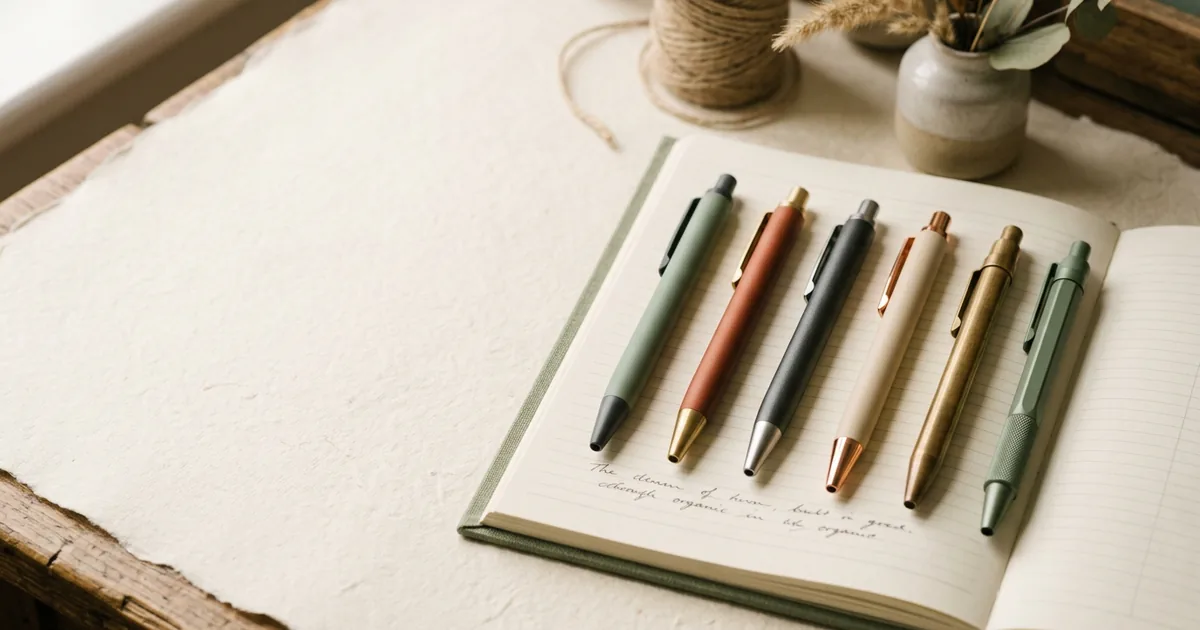
A pen handed out at a busy trade show in the hundreds is disposable by nature, so a reliable, inexpensive plastic pen with a clear, well-printed logo does the job. A pen given to a smaller number of important clients, or included in a welcome pack, deserves a heavier, metal-bodied pen that feels considered rather than mass-produced. Matching the pen quality to the audience and occasion avoids both overspending on giveaways and underspending on gifts that should make an impression.
Pen types and where they fit
| Pen type | Typical use | Feel |
|---|---|---|
| Basic plastic ballpoint | Mass giveaways, exhibitions, reception bowls | Light, functional |
| Recycled/eco plastic pen | Sustainability-conscious giveaways | Light, good talking point |
| Soft-touch or rubberised pen | Everyday office giveaways | Comfortable grip, mid-weight |
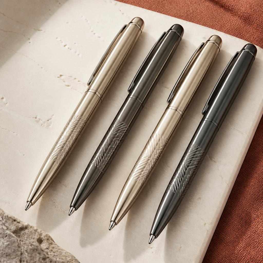
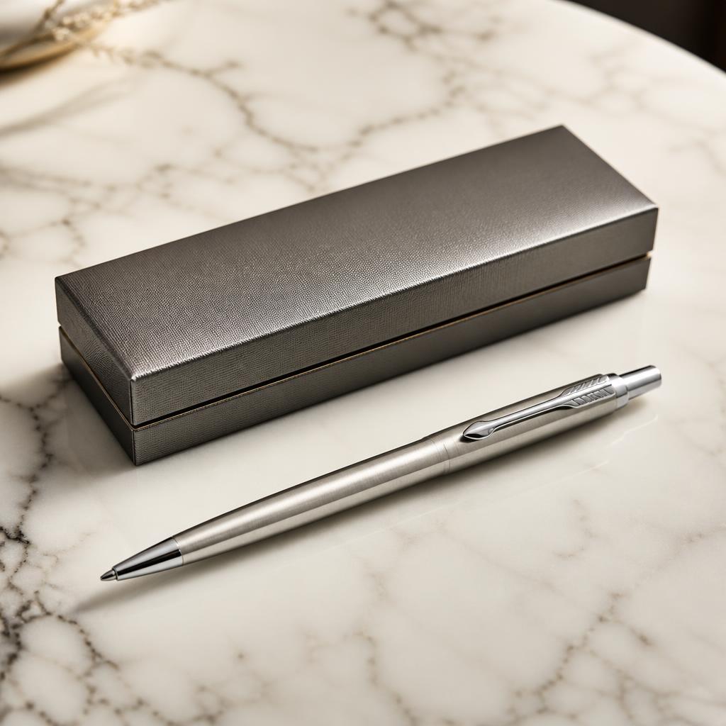
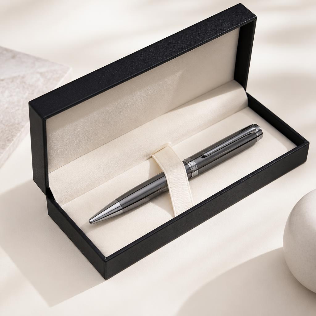
| Metal-bodied pen | Client gifts, corporate merchandise | Solid, premium |
What actually makes a pen get kept
Writing quality
This sounds obvious but is the most commonly overlooked factor: a pen that skips, scratches or runs out quickly gets thrown away regardless of how it looks. Ballpoint refills vary noticeably in smoothness between suppliers, so it's worth asking what refill is used rather than assuming all ballpoints perform the same.
Weight and grip
A pen that feels too light or too thin often gets dismissed as cheap even if the print looks good, while a pen with some heft and a comfortable grip diameter feels more substantial and gets picked up again. Soft-touch coatings and contoured grips both help here without necessarily costing much more.
Mechanism
Click mechanisms are generally preferred over twist-action for everyday use since they're faster to operate one-handed, though twist pens can feel slightly more premium and are common on metal executive pens. Cap-off pens are the cheapest but are the type most likely to be lost, since the cap and body are easily separated.
Print area and branding
Most pens offer a print area running along the barrel, which is usually enough for a logo and a short line of text such as a website address, but trying to fit a lot of detail into that narrow space just makes it illegible. Keep the design simple: a clear logo reads far better at a glance than a busy design crammed with contact details. Pad printing suits curved barrels and simple logos, while a wraparound digital print can cover more of the barrel with colour if the design calls for it.
Colour and finish
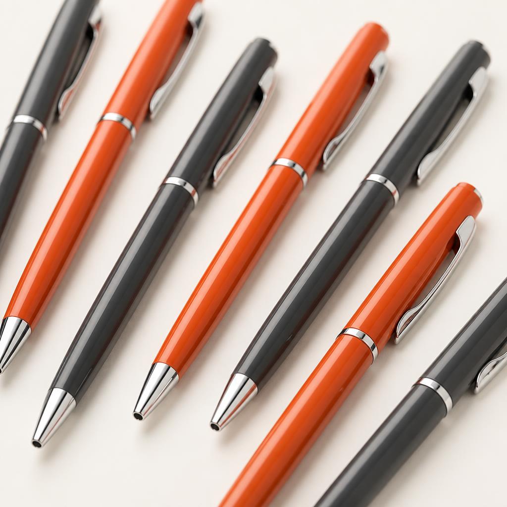
- Solid, on-brand barrel colours generally look more considered than a pen with the branding as an afterthought on a plain white body.
- Matte finishes show fingerprints less than gloss and often read as more premium.
- Coloured ink to match the pen or brand is available on most models and adds a nice finishing touch for gifted (rather than mass-handed-out) pens.
Budgeting sensibly
It's tempting to buy the cheapest pen available for a big giveaway run, but if the pen doesn't write well or falls apart within days, the branding exposure is wasted regardless of unit cost. A small step up in quality, even a few pence per unit, often pays for itself in how long the pen stays in circulation and gets shown to other people.
The short version
- Match pen quality to the occasion: giveaways can be simple, client gifts should feel considered.
- Writing quality and grip matter more to keep-rate than most people expect.
- Click mechanisms suit everyday use better than caps, which get lost.
- Keep the branding simple and legible rather than overcrowding the print area.