
Nearly every "the colour is wrong" conversation comes down to the same thing: your monitor mixes light, our press mixes ink, and they cannot reach the same set of colours.
RGB adds light, CMYK subtracts it
A screen starts black and adds red, green and blue light to make colour. Add all three at full strength and you get white. Print starts with white paper and subtracts light using cyan, magenta, yellow and black ink. Add all four heavily and you approach a muddy near-black.
Because light can be brighter than paper can be reflective, RGB covers a wider range of colours than CMYK. Vivid blues, electric greens, bright oranges and neon pinks all exist on screen but have no CMYK equivalent — they get converted to the nearest printable colour, which usually looks a shade flatter.
The colours that shift most
- Bright blue (around #0055FF) drifts towards purple. Reduce the magenta in your CMYK build to hold it back.
- Vivid green loses intensity and reads more olive.
- Neon and fluorescent anything cannot be reproduced with standard four-colour process at all.
- Very light greys can band or take on a colour cast if built from CMY rather than K only.
Building black properly
Small text should be 100 per cent K only — a single ink plate keeps edges razor sharp. Large solid black areas should use a rich black such as C40 M30 Y30 K100, otherwise they print as a washed-out charcoal. Never use registration black (all four at 100), which floods the paper and offsets onto the next sheet.
Getting closer to what you expect
- Design in CMYK from the start rather than converting at the end. You will pick colours that are actually achievable.
- Soft-proof in your design software with a coated FOGRA or GRACoL profile.
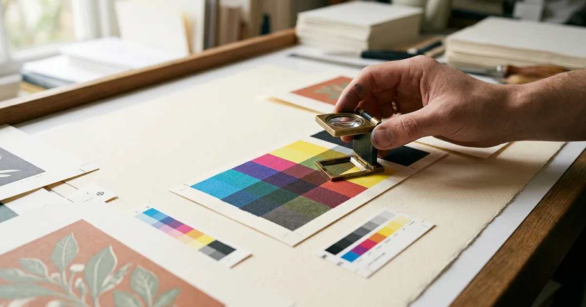
- Judge colour on paper, not on screen. Order a small quantity first if the colour is brand-critical.
- If a colour absolutely must match — a corporate blue, for example — ask us about a Pantone spot colour rather than fighting the CMYK build.
The paper matters too
The same file prints noticeably differently on gloss, silk and uncoated stock. Uncoated paper absorbs ink, so everything lands around 10 to 20 per cent softer. Matt lamination mutes colour slightly; gloss lamination deepens it. If you compare two jobs printed on different stocks and the colours differ, that is the paper, not an error.