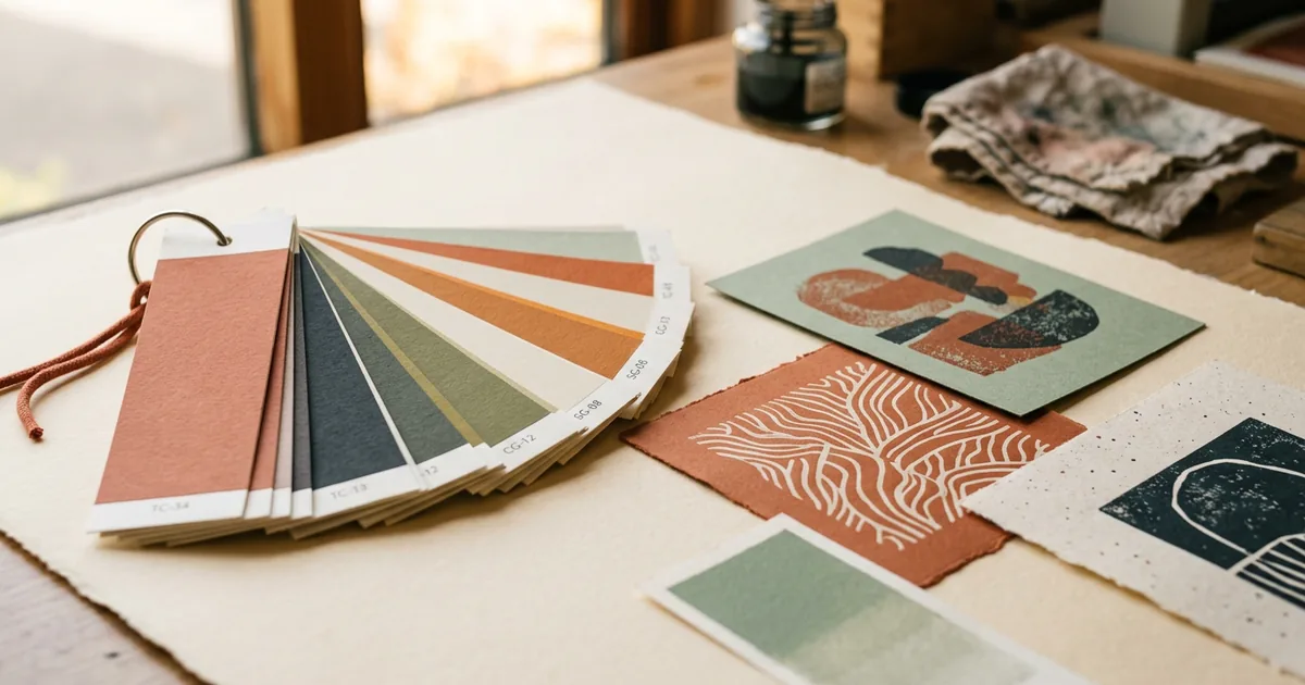
Pantone is a system of pre-mixed spot colours that prints as one exact, consistent ink, while CMYK builds colour from four process inks layered together — meaning Pantone gives tighter colour accuracy but CMYK is more practical for full-colour designs.
How CMYK works
Most everyday print — brochures, flyers, photographs, full-colour packaging — is printed using CMYK: cyan, magenta, yellow and black. These four inks combine in tiny dot patterns to simulate the full colour spectrum. It's efficient and versatile, but because colour is built from a mix, there's a natural amount of variation between print runs, printers, and even paper stocks.
How Pantone spot colour works
Pantone (often called PMS, the Pantone Matching System) is a library of pre-mixed inks, each with a reference number, so "Pantone 186 C" is the same red anywhere in the world it's mixed to spec. Rather than building the colour from dots of four inks, the printer uses that single pre-mixed ink directly. This removes the variability of process printing and is why brand guidelines almost always specify an exact Pantone reference for logos.
Key differences
| Aspect | CMYK | Pantone (spot) |
|---|---|---|
| How colour is made | Mixed from 4 process inks | Pre-mixed single ink |
| Consistency | Can vary slightly between runs | Very consistent |
| Best for | Photography, full-colour designs | Logos, exact brand colours |
| Cost on litho | Standard 4-colour setup | Extra ink station/cost |
| Digital print | Standard | Simulated, not true spot ink |
Why this matters for your brand
If your brand colour is a distinctive shade — a specific navy, a bright brand orange, a particular teal — the CMYK equivalent might drift depending on the press, the paper, and even the day it's printed. Specifying the Pantone reference gives your printer an exact target rather than an approximation, which matters most on business cards, packaging and signage where colour consistency directly affects brand recognition.
A note on digital printing
Most short-run and on-demand digital printing (the kind used for most online print orders) reproduces colour using CMYK toner or ink, even when a job is described as "Pantone matched." In this case, the printer converts the Pantone reference to its closest CMYK equivalent, which gets you close but not identical to a true spot-ink print. True spot colour typically requires litho printing with a dedicated ink station, which is more common on larger runs.
Practical advice for ordering
- Supply your Pantone reference in your artwork file if you have one, even for digital jobs — it helps the printer aim for the closest match
- Don't assume screen colour and print colour will match exactly; see our related article on RGB vs print colour
- For large flat brand-colour areas (like a solid background), small colour shifts are more noticeable than in photographic designs
- If exact colour matching is critical, ask whether the print method used is litho (true spot colour available) or digital (CMYK simulation)
The short version
- CMYK mixes four inks to build colour; good for photos and general full-colour work
- Pantone uses pre-mixed inks for exact, consistent brand colour
- Digital print usually simulates Pantone using CMYK, which gets close but isn't identical
- Supply your Pantone number for anything where exact brand colour matters most