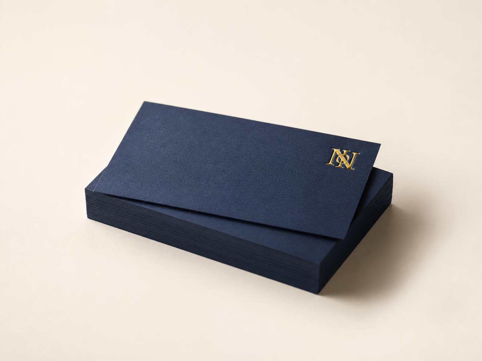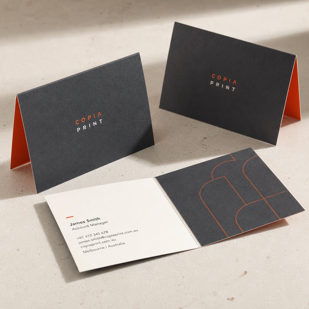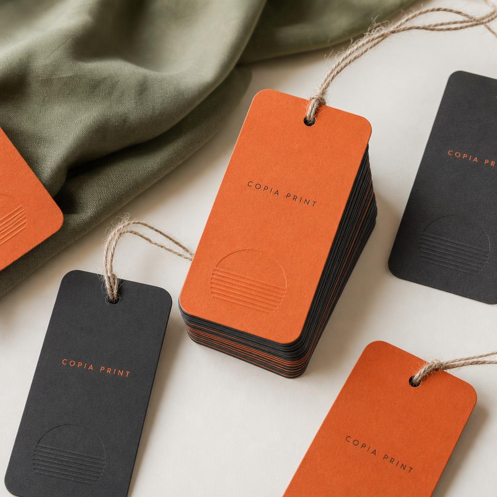
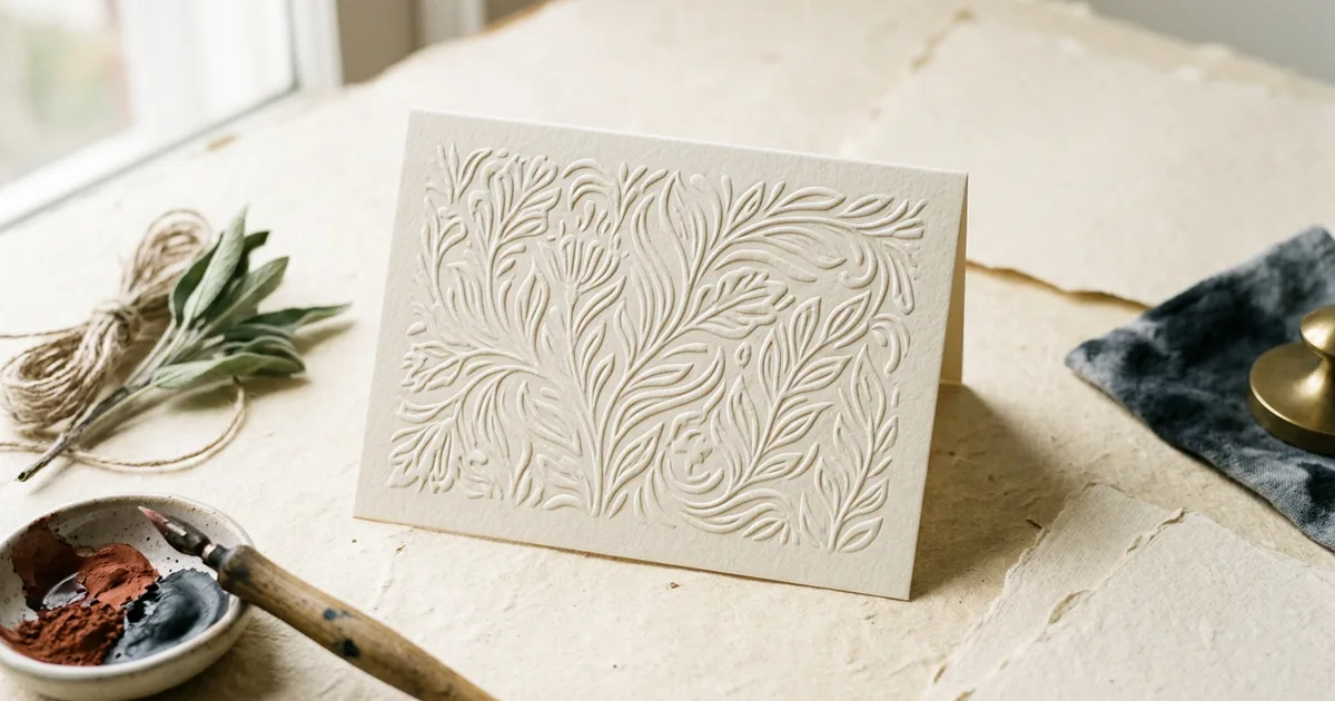
Embossing presses a design so it rises above the surface of the paper, and debossing presses a design so it sits below the surface — both create a tactile, three-dimensional effect without necessarily using any ink at all.
How the process works
Both techniques use a pair of matched metal dies — one raised, one recessed — between which the paper is pressed under heat and pressure. For embossing, the paper is pushed from underneath so the design rises up on the front face; for debossing, the design is pressed down into the sheet from the front. The die-making step is the main upfront cost, since a custom shape has to be engineered specifically for your design.
Blind versus combined finishes
"Blind" embossing or debossing means no ink or foil is used at all — the effect relies purely on the raised or recessed texture and the way it catches light. This gives a subtle, understated look often used for logos on premium stationery. Both techniques can also be combined with printing or foiling: a foil-stamped area can be embossed at the same time for a raised metallic effect, which tends to look particularly striking on business cards and invitations.
Embossing vs debossing at a glance
| Feature | Embossing | Debossing |
|---|---|---|
| Direction | Raised above surface | Pressed below surface |
| Visual effect | Bold, prominent, catches light strongly | Subtle, refined, quieter shadow effect |
| Best paper | Thicker, uncoated or lightly coated stock | Thicker, uncoated or lightly coated stock |
| Common combination | Foil + emboss for raised metallic logo | Blind deboss for understated branding |
Which paper works best
Both techniques need a reasonably heavy, slightly softer stock to hold the impression cleanly and durably — very thin or very hard-surfaced paper can crack, tear, or spring back and lose definition over time. Uncoated and lightly coated stocks in the region of 300gsm and above generally hold an emboss or deboss much better than thin, glossy paper.
Design considerations
- Simple, bold shapes and typefaces work best — very fine detail or thin serif lines can be lost or become fragile in the die
- Leave enough surrounding blank space around an embossed or debossed area so the paper isn't distorted elsewhere
- Consider how the piece will be printed on the reverse — a strong emboss can show through as a faint texture on the back of the sheet
- Blind deboss on a plain, uncoated card is one of the most cost-effective ways to add a premium, tactile detail without extra ink costs
Where it works best
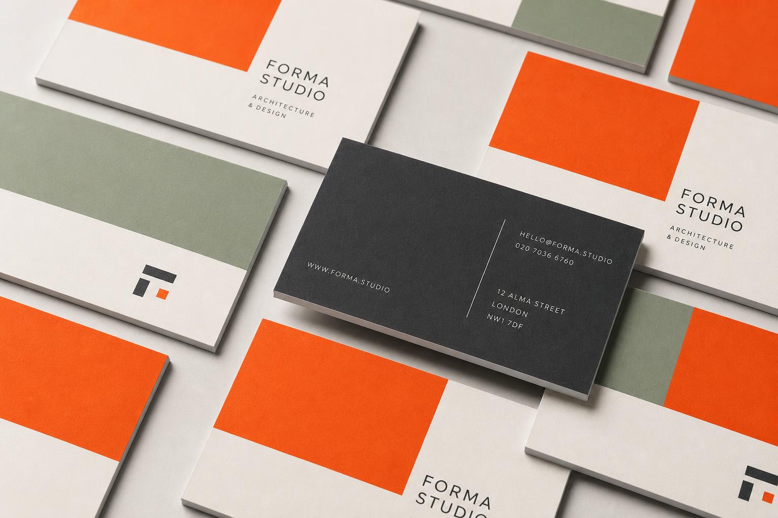
Business cards and folded cards are the most common home for embossing and debossing, since the tactile detail is felt as soon as someone picks the item up — a genuinely different sensory cue compared with flat print. Swing tags and premium packaging also benefit, where a debossed logo can reinforce a quality positioning without adding visual clutter. It's less suited to high-volume, low-cost items like flyers or leaflets, where the die cost and slower production speed don't make commercial sense.
The short version
- Embossing raises a design; debossing presses it in — both create texture, not colour
- "Blind" versions use no ink; combined foil-and-emboss gives a raised metallic effect
- Use heavier, slightly softer paper (around 300gsm+) for a clean, lasting result
- Best suited to cards, tags and stationery that are physically handled