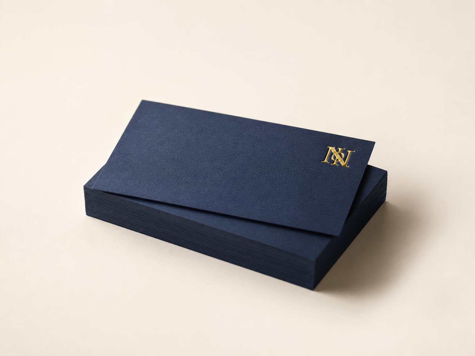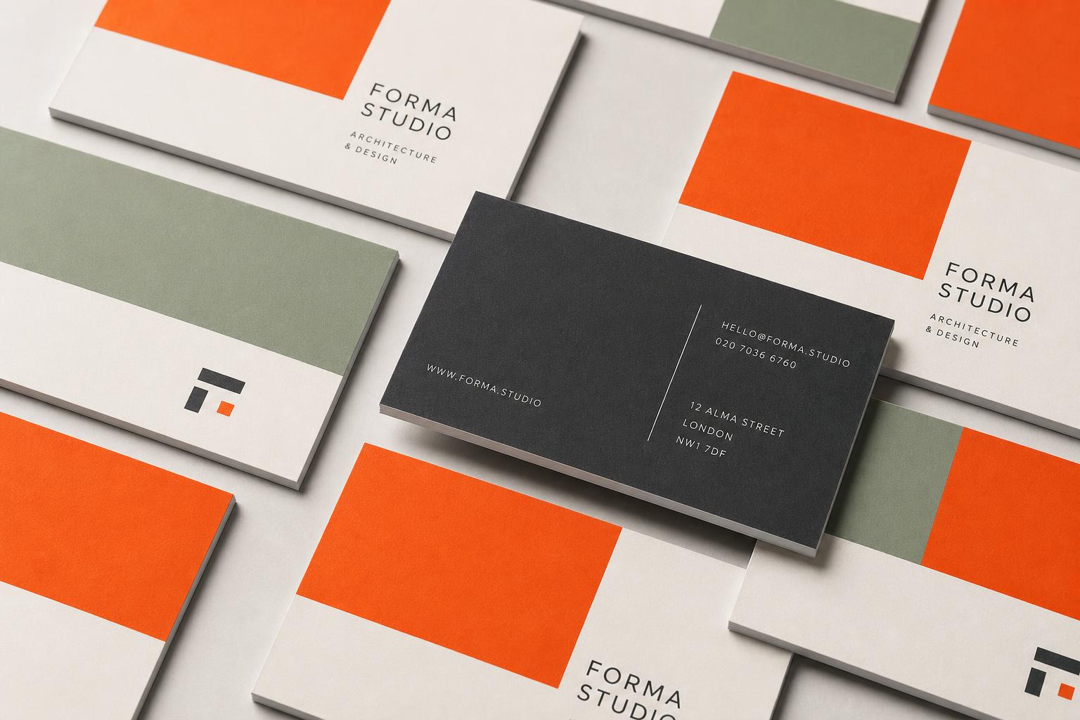

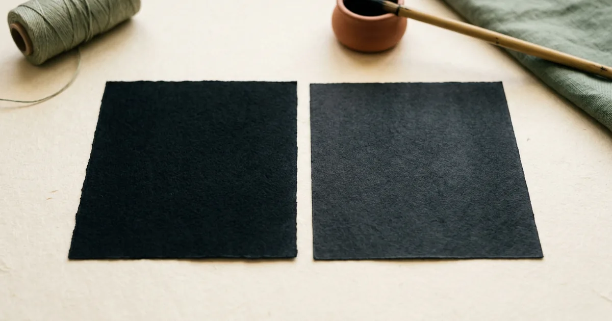
Plain black uses only the K (black) ink and prints crisp fine detail, while rich black adds a touch of cyan, magenta and yellow underneath the black to create a deeper, denser tone — the right choice depends on whether you're printing small text or a large solid area.
What "plain black" means
In CMYK printing, plain (or "100% K") black uses only the black ink channel, so the build is C0 M0 Y0 K100. This is the standard choice for body text, fine lines and small detail, because using a single ink keeps edges sharp — there's no risk of the four ink layers misregistering (lining up slightly off) and creating a blurred or fringed edge on small text.
What "rich black" means
Rich black adds small amounts of the other process colours underneath the black ink to increase density and depth. A common rich black build is roughly C60 M40 Y40 K100, though exact recipes vary by printer. The result is a deeper, more saturated black that avoids the slightly grey or washed-out look that 100% K alone can have over a large area, especially on uncoated paper.
When to use which
| Use case | Recommended black | Why |
|---|---|---|
| Body text / small print | Plain (100% K) | Keeps edges sharp, avoids misregistration blur |
| Large solid background | Rich black | Deeper, more even tone, avoids a grey/flat look |
| Fine lines/logos | Plain (100% K) | Fine detail stays crisp |
| Photographic dark areas | Rich black (built into image) | More natural depth in shadows |
Why plain black can look grey
Black ink alone is not always as dense as people expect, particularly over a large flat area. Under normal lighting, a big block of 100% K can appear slightly flat or greyish compared with the deep, almost matte-black look many designers want for premium packaging, business cards or dark backgrounds. This is where rich black earns its keep.
Getting rich black right
The main risk with rich black is total ink coverage — if you add too much cyan, magenta and yellow on top of full black, the combined ink laid on the paper can exceed what the press and paper can properly dry and hold, leading to a shiny, tacky, or even cracking finish, especially on uncoated stock. A sensible total ink limit (often around 240–300% depending on the printer's specification) keeps rich black looking good without causing production problems.
Practical tips
- Use plain 100% K for all body text and fine detail, never rich black on small text
- Use a moderate rich black build (not simply 100% on all four channels) for large solid black areas
- Check your printer's recommended rich black formula and total ink limit before submitting artwork
- On uncoated or textured paper, be more conservative with rich black to avoid drying issues
The short version
- Plain black (100% K) is best for text and fine detail — sharp and reliable
- Rich black (K plus a little C, M, Y) gives deeper, denser large solid areas
- Never use rich black for small text — misregistration can blur the edges
- Keep total ink coverage within your printer's recommended limit