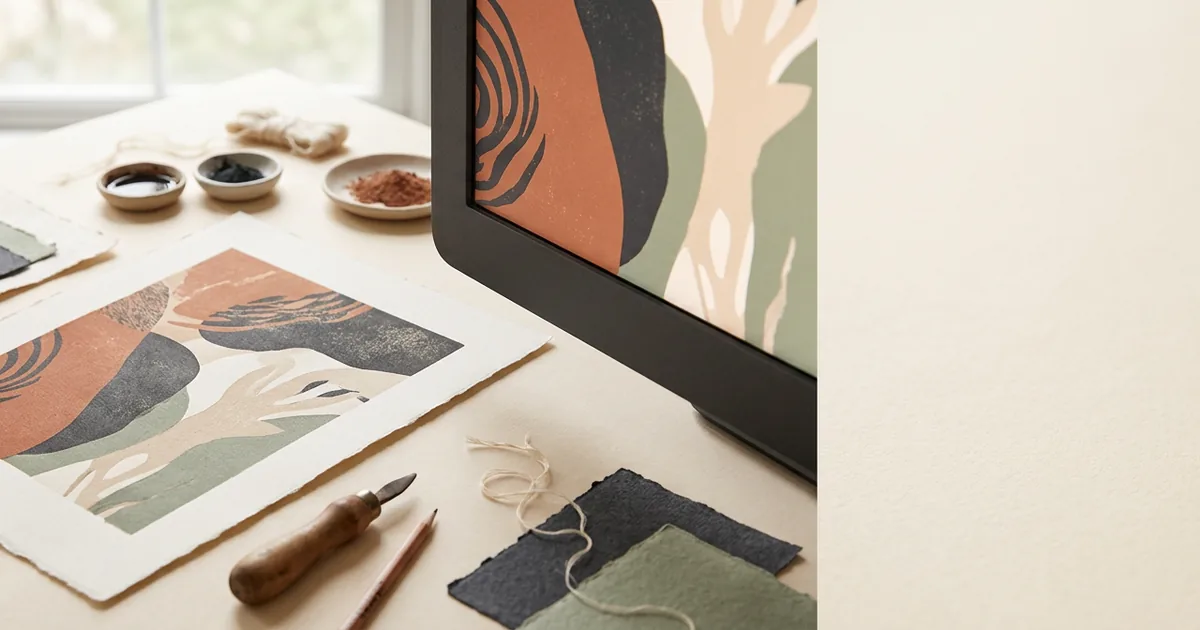
Your screen builds colour from glowing red, green and blue light, while a printer builds colour from cyan, magenta, yellow and black ink reflecting light off paper — two fundamentally different processes, which is why what you see on screen is never a perfect preview of the printed result.
Light versus ink
Monitors are "additive" — they start from black and add red, green and blue light to create colour, and combining all three at full strength produces white. Print is "subtractive" — it starts from white paper and adds ink that absorbs (subtracts) certain wavelengths of light, so combining all the inks moves toward black, not white. These are opposite starting points, and no amount of screen calibration removes that basic difference.
Why RGB has a wider range
Screens can typically display a wider and more vivid range of colours than a printer can reproduce, especially in bright, saturated blues, greens and neons. When a file created in RGB is converted to CMYK for print, those vivid RGB colours are compressed into the smaller range CMYK ink can achieve — this is called "gamut compression," and it's the main reason a bright screen colour can look duller or shifted once printed.
Common shifts to expect
| Screen colour | Typical print outcome |
|---|---|
| Bright/neon blue | Often prints slightly more muted or purple-leaning |
| Vivid green | Can shift towards a duller, more olive tone |
| Deep purple | May print darker or more blue |
| Bright orange | Usually reproduces reasonably close |
Other factors that affect the match
Beyond the RGB/CMYK gap, several other things affect how close a print will look to your screen: screen brightness and calibration (screens vary hugely between devices and are often set brighter than accurate), ambient lighting when you view the printed piece, and the paper stock itself — coated paper reflects light differently to uncoated, which affects how vivid or muted the same ink looks.
What you can do about it
- Design and supply artwork in CMYK from the start where possible, rather than converting RGB at the last minute
- Avoid relying on very bright, saturated colours for large areas if colour accuracy is critical
- Ask your printer whether a physical proof is available before a large or critical run
- Remember that two different screens showing you the same file may also disagree with each other — the issue isn't unique to print
Is there a way to guarantee a match?
Nothing guarantees an identical match between screen and print, because they are physically different ways of producing colour. The closest you can get is specifying exact Pantone references for critical brand colours (see our Pantone vs CMYK guide), designing in CMYK from the outset, and requesting a hard-copy proof for anything where colour accuracy really matters, such as branded stationery or packaging.
The short version
- Screens use light (RGB); print uses ink (CMYK) — the two systems can't match perfectly
- Bright, saturated screen colours are most likely to shift when printed
- Paper stock and screen calibration both affect the perceived difference
- Design in CMYK and request a proof for colour-critical jobs