

Colour & finishing
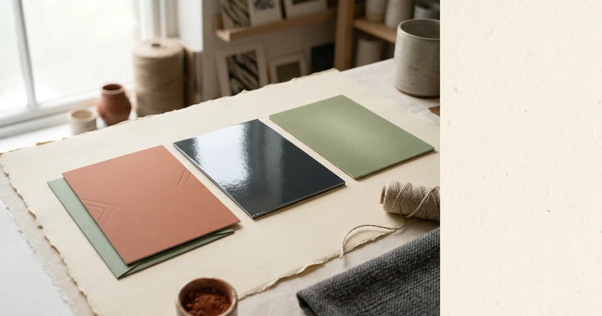
Matt, gloss or soft-touch: choosing a lamination
Lamination changes how a printed piece feels, how long it lasts and how your colours look. Here is what each finish does.
3 August 2026 · 4 min read
Everything our studio team gets asked most: which stock to choose, how to set artwork up properly, why colours shift between screen and press, and how to get the best result from every product we print.
Colour & finishing
Lamination changes how a printed piece feels, how long it lasts and how your colours look. Here is what each finish does.
3 August 2026 · 4 min read
Colour & finishing
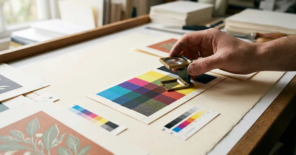
Screens make colour with light, presses make it with ink. Understanding that one difference explains almost every colour surprise in print.
28 July 2026 · 5 min read
Colour & finishing
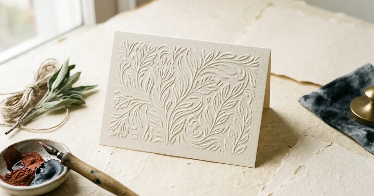
Embossing raises a design above the paper surface and debossing presses it in, both adding tactile detail without ink.
25 May 2026 · 3 min read
Colour & finishing
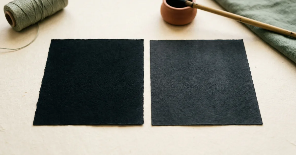
Rich black mixes black ink with colour for a deeper, denser result, while plain black uses just one ink and can look grey.
19 May 2026 · 3 min read
Colour & finishing
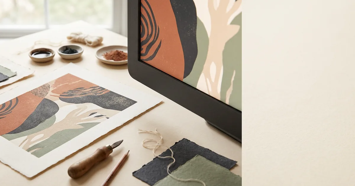
Screens create colour with light (RGB) while print uses ink (CMYK), so some colours simply cannot match exactly.
16 May 2026 · 3 min read
Colour & finishing
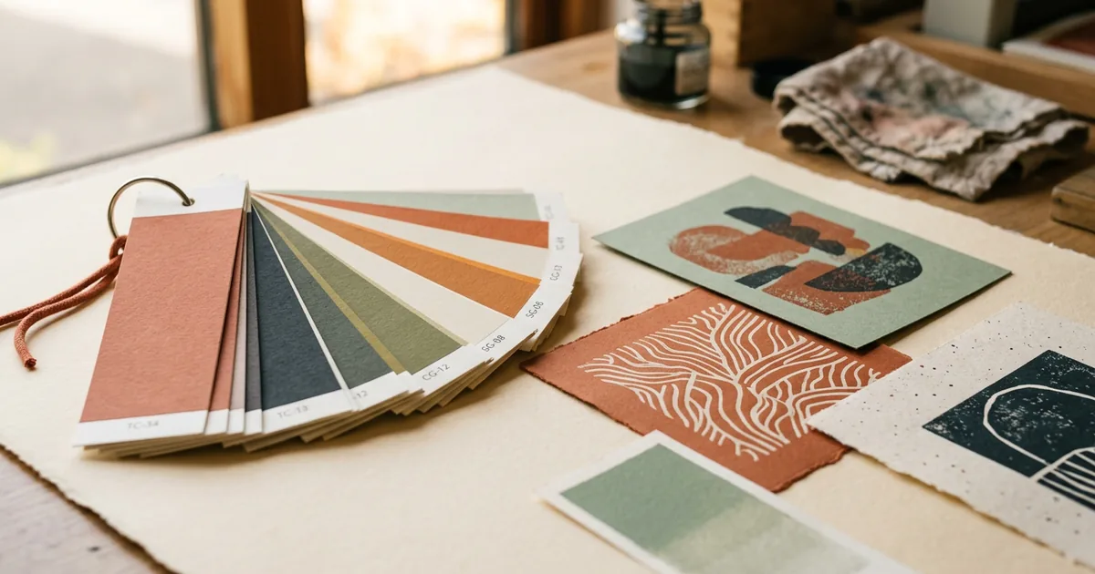
Pantone spot colours give exact, consistent brand colour, while CMYK builds colour from four inks and can vary slightly.
13 May 2026 · 3 min read
Colour & finishing
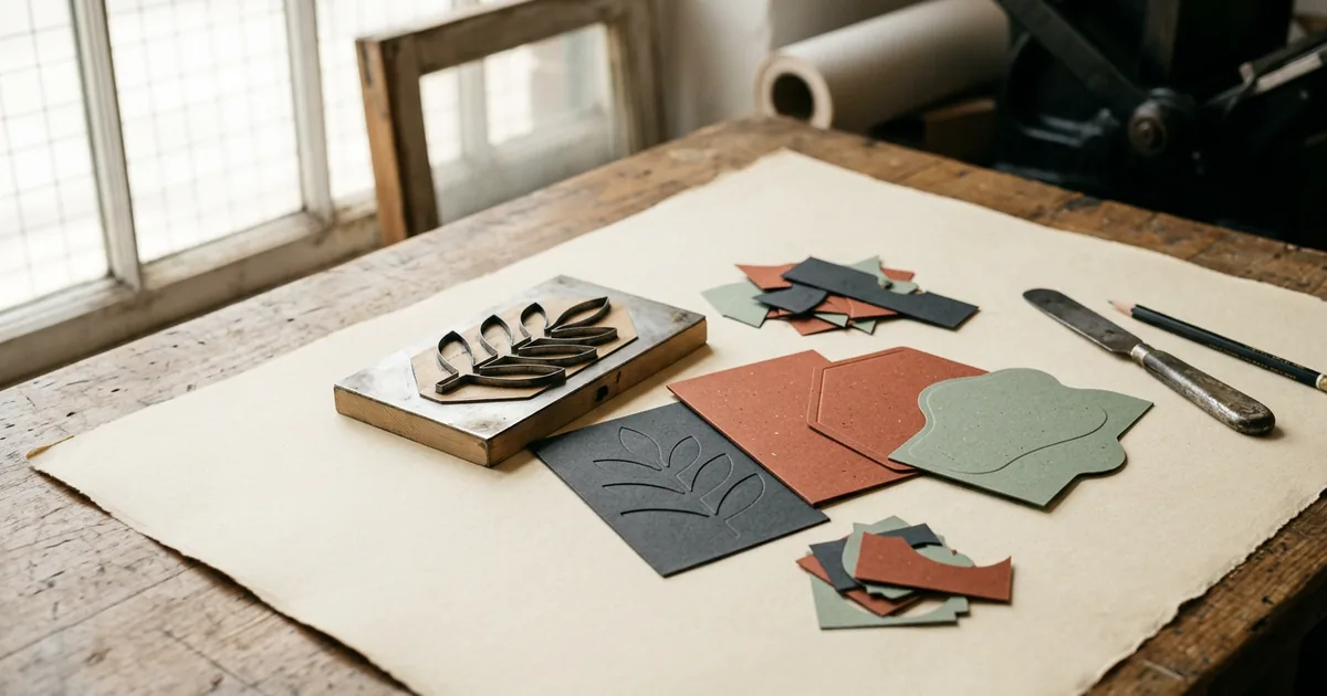
Die cutting lets you print in almost any shape, from rounded business cards to custom swing tags and boxes.
10 May 2026 · 3 min read
Colour & finishing
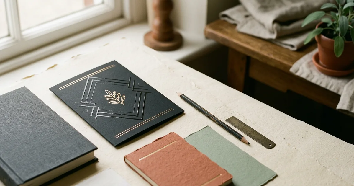
Spot UV adds glossy highlights while foiling adds metallic shine — both work best used sparingly on key details.
7 May 2026 · 3 min read